
Why SwiftUI might just convert me to an iOS developer
Confession time. I hated iOS development. First, there was Objective-C (which was a nightmare of epic proportions for cryptic syntax), then there was the Storyboards. Both of them forced you into using what is quite possibly the worst IDE on the market today (XCode), all so you could fit into the Apple ecosystem walled garden, where everything is controlled. Then Swift came along, so I took another look. I loved the direction that Swift was going, but Storyboards and the unintuitive IDE still killed in.
SwiftUI might have changed all that for me.
I’ve spent the last two days pretty much learning SwiftUI, and I’ve been enjoying it. That’s something I couldn’t say about the older efforts to learn iOS programming. First, I looked at the Apple tutorials, then went onto Hacking with Swift - one of my favorite sites right now. Finally, I got down to challenge myself. I have always admired the artists who post their work on sites like UpLabs and Dribbble, so I decided to take a look and see if I could replicate one of their UIs within SwiftUI.
I could, and it only took my about half an hour.
The project
The project I chose was a Weather app by Chris Iwan, who provided the screen shots and colors. Here is the screen shot:
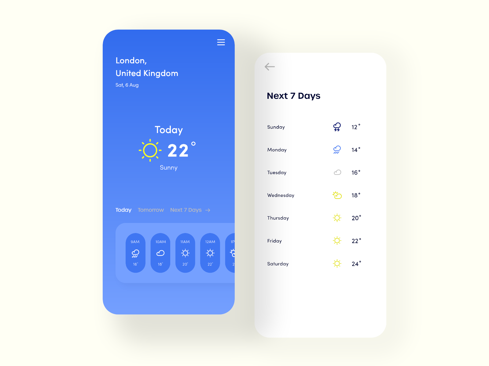
He also provided five colors for a palette, which we will get onto within the code.
To get started, I created a single page app within XCode, and selected SwiftUI as the UI language. I switched this up a little bit in getting started. I created four new groups (using right-click on the folder and then selecting New Group…):
Sceneswill be where I place my completed scenes.Utilswill be where I place my utility functions.Modelsfor model data classes.Componentswill be where I place the component views of my completed scenes.
I also copied the five colors into a Utils/Palette.swift file, as follows:
import SwiftUI

func ColorFromRGB(rgb: UInt) -> Color {
    return Color(
        red: Double((rgb & 0xFF0000) >> 16) / 255.0,
        green: Double((rgb & 0x00FF00) >> 8) / 255.0,
        blue: Double(rgb & 0x0000FF) / 255.0
    )
}

struct Palette {
    static let color1 = ColorFromRGB(rgb: 0x0F32E3)
    static let color2 = ColorFromRGB(rgb: 0xC6C6B3)
    static let color3 = ColorFromRGB(rgb: 0xABB7D2)
    static let color4 = ColorFromRGB(rgb: 0x506ED1)
    static let color5 = ColorFromRGB(rgb: 0x65737E)
}
Nothing special here. The ColorFromRGB function is adapted from a version for a UIColor from Stack Overflow. Then, I converted the CSS colors from the Dribbble page into the palette.
I also moved my ContentView.swift into Scenes and renamed it to TodaysWeather.swift. This involved some adjustments in SceneDelegate.swift to get it all working again.
Creating the background.
SwiftUI allows me to compose views that I create, so I took the opportunity to break the provided UI into component parts. The first thing I noticed on the page was that striking background. It’s a linear gradient from the darker blue to the lighter blue. A quick google showed me how to produce a linear gradient, and a further google showed me how to make it full screen. I created a new SwiftUI file called Components/BackgroundGradient.swift, then put the following code in:
import SwiftUI
struct BackgroundGradient: View {
var body: some View {
Rectangle()
.fill(LinearGradient(
gradient: Gradient(colors: [ Palette.color1, Palette.color4 ]),
startPoint: .top, endPoint: .bottom
))
.edgesIgnoringSafeArea(.all)
}
}
#if DEBUG
struct BackgroundGradient_Previews: PreviewProvider {
static var previews: some View {
BackgroundGradient()
}
}
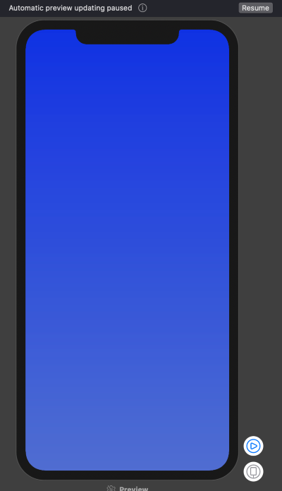
#endifOne of the most awesome features about SwiftUI is the live preview. On the right hand side of the XCode window is a preview area. Click on Resume in the top-right corner (it’s almost always needed), and see your work of JUST THIS COMPONENT. Finally, I can develop individual components and see them with real data injected without having to worry about the entire app.
One of the nice things about XCode is its auto-completion for Swift. It’s something that most IDEs do today, and XCodes version isn’t as good as (say) Visual Studio Code. (Honestly, I can’t wait until someone writes a SwiftUI for VS Code plugin!)
Now I need to integrate that component into my Scenes/TodaysWeather.swift:
import SwiftUI

struct TodaysWeather: View {
    var body: some View {
        ZStack {
            BackgroundGradient()
        }
    }
}

#if DEBUG
struct WeatherScene_Previews: PreviewProvider {
    static var previews: some View {
        TodaysWeather()
    }
}
#endif
The ZStack allows you to stack views on top of one another, like they are coming out of the phone (as opposed to HStack, which is horizontally across the scene, and VStack, which is vertically down the scene). Thus, whatever else I put below the BackgroundGradient() call will be on top of the background.
The title section
The title section consists of the city, country, and date that the data was provided. My initial foray into this tried to do everything at once - dynamic data as well as UI. That was a complete disaster because XCode isn’t particularly good with error messages. They tend to be indicative of an error, but not actually tell you what the error is. Since I have live preview, I can get the UI working first with static data, then work on the dynamic data later. (Dynamic data is a topic for another blog.)
I work directly in the Scenes/TodaysWeather.swift file for the initial work, then abstract the component to its own file. This title is made up of three text blocks in a VStack:
struct TodaysWeather: View {
    var body: some View {
        ZStack {
            BackgroundGradient()
            VStack(alignment: .leading) {
                Text("London,")
                Text("United Kingdon")
                Text("Sat, 6 Aug")
            }
        }
    }
}
This puts them in the middle of the screen (rather than in the top-left corner), and the font settings (like color and size) are wrong. To move them into the right position, wrap the VStack in a HStack, then use a Spacer() to fill in the rest of the space. You can use the same “wrap-and-useSpacer()” trick to move the block to the top of the screen.
To correct the font style, use modifiers on the Text() blocks. The two basic ones here are .foregroundColor() and .font():
struct TodaysWeather: View {
    var body: some View {
        ZStack {
            BackgroundGradient()
            VStack {
                HStack {
                    VStack(alignment: .leading) {
                        Group {
                            Text("London,").font(.title)
                            Text("United Kingdon").font(.title)
                            Text("Sat, 6 Aug").font(.subheadline).fontWeight(.light)
                        }
                        .foregroundColor(.white)
                        .padding(.bottom, 6)
                    }
                    Spacer()
                }
                Spacer()
            }.padding(.leading)
        }
    }
}
The Group doesn’t provide any visual changes, but allows you to group views together and apply style to all the elements. Most of this is done visually. I adjust the code, adding padding, changing fonts or colors, etc. Once I am happy with the visual preview, I lock it in - abstracting the code to a new view - in this case Components/Header.swift.
The hourly weather list
To determine what to do next, I look at the spacing and move in from the outside. Since this is a vertical display, I’m going to work top+bottom into the center, so the next thing to work on is the horizontally scrolling list. I actually saw this in a tutorial. It basically comes down to this:
- Create a list of items to go in your scrolling list.
- Create a view that holds a single item.
- Create a
ScrollingViewto hold the collection of views.
I need a model for “hourly data”. This is just a struct with some data (stored in Models/Hourly.swift):
import Foundation
struct Hourly {
let hour: Int
let temp: Int
let icon: String
}
#if DEBUG
let hourlyTestData: [Hourly] = [
Hourly(hour: 9, temp: 15, icon: "cloud.rain"),
Hourly(hour: 10, temp: 18, icon: "cloud"),
Hourly(hour: 11, temp: 20, icon: "sun.max"),
Hourly(hour: 12, temp: 22, icon: "sun.max"),
Hourly(hour: 13, temp: 23, icon: "sun.max"),
Hourly(hour: 14, temp: 23, icon: "cloud"),
Hourly(hour: 15, temp: 22, icon: "cloud"),
Hourly(hour: 16, temp: 21, icon: "cloud"),
Hourly(hour: 17, temp: 20, icon: "wind"),
Hourly(hour: 18, temp: 19, icon: "wind")
]
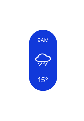
#endifWhere did I get the icon names from? There is an app called SF Symbols that contains the list of symbols provided with iOS - it’s really useful. The names of those icons can be used as an Image(), as we will see. Here is the code in Components/HourlyWeather.swift:
import SwiftUI

struct HourlyWeather: View {
    var body: some View {
        VStack {
            Text("9AM")
                .font(.caption)
                .padding(.top)
            Image(systemName: "cloud.rain")
                .resizable()
                .padding()
            Text("18°")
                .font(.callout)
                .padding(.bottom)
        }
        .frame(width: 64, height: 140)
        .background(Palette.color1)
        .foregroundColor(.white)
        .cornerRadius(32)
    }
}

#if DEBUG
struct HourlyWeather_Previews: PreviewProvider {
    static var previews: some View {
        HourlyWeather()
    }
}
#endif
We need to integrate the hourly weather data into this as otherwise it won’t be a proper list. To do this, the HourlyWeather object needs to take an Hourly object. Here is how I adjusted it:
import SwiftUI

struct HourlyWeather: View {
    let data: Hourly

    var body: some View {
        let timeString: String = data.hour <= 12 ? "AM" : "PM"

        return VStack {
            Text(String(data.hour) + timeString)
                .font(.caption)
                .padding(.top)
            Image(systemName: data.icon)
                .resizable()
                .padding(14)
            Text(String(data.temp) + "°")
                .font(.callout)
                .padding(.bottom)
        }
        .frame(width: 64, height: 140)
        .background(Palette.color1)
        .foregroundColor(.white)
        .cornerRadius(32)
    }
}

#if DEBUG
struct HourlyWeather_Previews: PreviewProvider {
    static var previews: some View {
        HourlyWeather(data: hourlyTestData[0])
    }
}
#endif
The degree symbol is Option+Shift+8 on the Mac keyboard.
The preview of this is looking pretty good (but not the same as the original):
This now needs to go into a ScrollView object in the TodaysWeather.swift file:
struct TodaysWeather: View {
    var body: some View {
        ZStack {
            BackgroundGradient()
            VStack {
                Header()
                Spacer()
                ScrollView(.horizontal) {
                    HStack(spacing: 10) {
                        ForEach(hourlyTestData, id: \.hour) { data in
                            HourlyWeather(data: data)
                        }
                    }
                    .padding()
                    .background(Palette.color4)
                    .cornerRadius(32)
                }.padding(.bottom)
            }.padding(.leading)
        }
    }
}
You can’t actually see the scrolling in action unless you switch to “live preview”. That’s the play button in the lower-left corner of the preview window. You should now be able to see the preview and slide it:
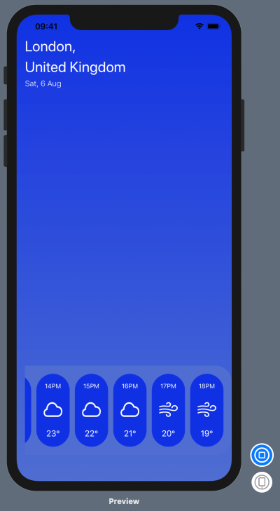
Todays weather
We are now bringing this UI together, and have done most of the complex stuff. I added a new view called DailyNavigationView to produce the “Today Tomorrow Next 7 days” links, and that just leaves us with todays weather, in the middle of the page. Again, this is being produced as a component:
import SwiftUI

struct TodaysWeatherView: View {
    var body: some View {
        VStack {
            Text("Today")
                .font(.largeTitle)
                .foregroundColor(.white)
            HStack {
                Image(systemName: "sun.max")
                    .resizable()
                    .foregroundColor(.yellow)
                    .frame(width: 72, height: 72)
                Text("22°")
                    .font(Font.system(size: 64))
                    .fontWeight(.bold)
                    .foregroundColor(.white)
            }
            Text("Sunny")
                .font(.title)
                .fontWeight(.light)
                .foregroundColor(.white)
        }
    }
}

#if DEBUG
struct TodaysWeatherView_Previews: PreviewProvider {
    static var previews: some View {
        TodaysWeatherView().background(Palette.color4)
    }
}
#endif
The interesting part of this is that this component is meant to be on a darker background. If you don’t adjust the preview part of the code, you won’t be able to see the preview because it will be white-on-white text. I’ve adjusted the preview to have a darker color from my palette. It won’t be exactly the same (athough you could make it so). I can now put this into my main scene:
import SwiftUI

struct TodaysWeather: View {
    var body: some View {
        ZStack {
            BackgroundGradient()
            VStack {
                Header()
                Spacer()
                TodaysWeatherView()
                Spacer()
                DailyNavigationView()
                ScrollingHourlyWeather()
            }.padding([.leading, .bottom])
        }
    }
}

#if DEBUG
struct WeatherScene_Previews: PreviewProvider {
    static var previews: some View {
        TodaysWeather()
    }
}
#endif
Take a look at the preview:
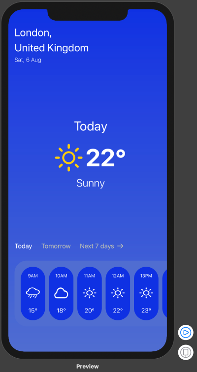
It looks pretty close to what I am expecting. I can probably get this even closer by working on replicating the fonts (including sizes and weights) and exact color matching, but this is good enough to get me going on the dynamic data side of things. That’s a topic for next time.
Leave a comment