
Create a bubble background in SwiftUI
I’m continuing to explore SwiftUI, trying to recreate user interfaces that I see on design labs. The latest one is a task list app, found on Uplabs, and created by Rudi Hartano. I liked the design so I decided to replicate it from the Adobe XD file that he provided. One of the pieces he uses is a bubble background:
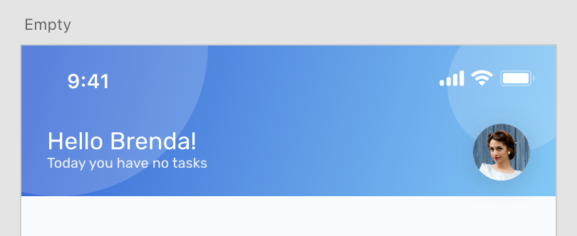
The Adobe XD file shows me that I can use a linear gradient between two colors. However, there are also two slightly translucent circles on the top of it. If I were in Android land, I’d just create a PNG from the Adobe XD file. However, iOS has a number of different aspect ratios. That means that the circles might become elongated on one device while looking fine on another. So, I really wanted to find another way.
Let’s start with my palette object. I always create a Utils/Palette.swift with my colors and gradients in them. This makes them easier to access and allows me to understand when I am using a color that is too close to another color. I can use a tool like Paletton to design a color scheme and put that here. Here is todays version:
import Foundation
import SwiftUI

func ColorFromRGB(rgb: UInt) -> Color {
    return Color(
        red: Double((rgb & 0xFF0000) >> 16) / 255.0,
        green: Double((rgb & 0x00FF00) >> 8) / 255.0,
        blue: Double(rgb & 0x0000FF) / 255.0
    )
}

struct Palette {
    /* Put all your colors here */

    /* And your gradients! */
    static let headerGradient = Gradient(colors: [
        ColorFromRGB(rgb: 0x3867D5), ColorFromRGB(rgb: 0x81C7F5)
    ])
}
The ColorFromRGB function allows me to convert from the hex values to Color objects that SwiftUI uses. Now, I create a Views/HeaderBackground.swift file with the following contents:
import SwiftUI

struct HeaderBackground: View {
  var body: some View {
    let background = LinearGradient(
      gradient: Palette.headerGradient,
      startPoint: .topLeading, endPoint: .bottomTrailing)

    return Rectangle()
      .fill(background)
      .edgesIgnoringSafeArea(.top)
  }
}

#if DEBUG
struct HeaderBackground_Previews: PreviewProvider {
  static var previews: some View {
    VStack {
      ZStack {
        HeaderBackground()
      }.frame(height: 100)
      Spacer()
    }
  }
}
#endif
There are two points here:
- I’ve altered the default
Previewssection so that the headerbackground appears “in context” - i.e. with the minimal layout to make it a header. - The header is just a filled rectangle, where the fill is the linear gradient. Note that I’ve used
.edgesIgnoringSafeArea()to allow the header to bleed into the top of the scene, overlapping the status bar.
This gives me the base of my background. Now there are two other elements - both circles. You can draw circles with the Circle() method, size them with .frame(), position them with the .position() modifier, and adjust the opacity with .opacity(). The left hand circle can be added like this:
struct HeaderBackground: View {
  var body: some View {
    let background = LinearGradient(
      gradient: Palette.headerGradient,
      startPoint: .topLeading, endPoint: .bottomTrailing)

    return Group {
      Rectangle()
        .fill(background)
        .edgesIgnoringSafeArea(.top)
      Circle()
        .frame(width: 180, height: 180)
        .foregroundColor(.white)
        .opacity(0.17)
        .position(x: 0, y: 0)
    }
  }
}
I can only return one element from a view, but that is easily overcome by using a Group element.
The x/y values for position are relative to the top-left corner, not including the safe area. You can make them positive or negative, and the image will be clipped by the viewable area. This version is great when you know where you want to position the element because it’s on the left hand side of the scene.
But what about the right hand side? For that, I need to know the width of the scene. I can do this with GeometryReader, like this:
struct HeaderBackground: View {
  var body: some View {
    let background = LinearGradient(
      gradient: Palette.headerGradient,
      startPoint: .topLeading, endPoint: .bottomTrailing)

    return Group {
      Rectangle()
        .fill(background)
        .edgesIgnoringSafeArea(.top)
      Circle()
        .frame(width: 180, height: 180)
        .foregroundColor(.white)
        .opacity(0.17)
        .position(x: 0, y: 0)
      GeometryReader { geometry in
        Circle()
          .frame(width: 92, height: 92)
          .foregroundColor(.white)
          .opacity(0.17)
          .position(x: geometry.size.width - 20, y: 30)
      }
    }
  }
}
The important piece here is geometry.size.width and geometry.size.height provide the size of the parent element, so now I can position absolutely and ensure that they are properly positioned. Another couple of ideas here:
- Use the geometry to set the size of the circle so they always appear to be the same relative dimensions.
- Create more circles on a wider screen (for example, an iPad).
The resulting code for this one looks like this in the preview:
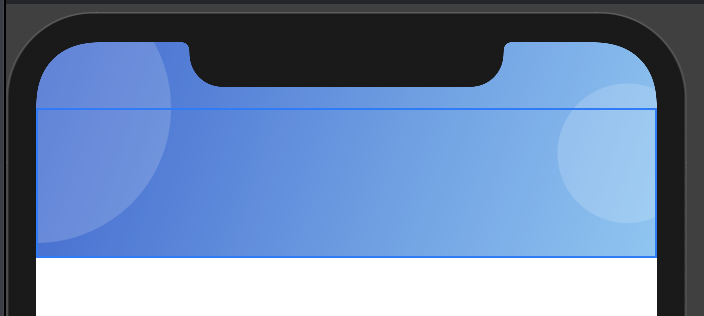
As you can see, it’s pretty close! To get an exact match, all I have to do is mess with the x/y positioning and size of each circle.
Leave a comment