
Tailwind Photos: The Splash Screen
I’m building a demo Android app that is sort of like Instagram, but with some new cloud features (which I will mention as I go along) and a different design to make it different. I plan to build this with the latest architecture for Android, in Kotlin, and learning a bunch of Android dev tricks along the way. As with everything, there is a start, and this is that post. I’m not going to tell you how to build your first Android app - there are plenty of tutorials on that. I’m just going to cover some of the things that I found useful.
Yes, this is a tutorial sort of post series that will help me remember tricks for Android. I just hope it is useful for you too.
Building a Splash Screen
One of the things I want to do is store a bunch of configuration and feature flags remotely. This means I’m going to need to go to the network to download that configuration before I can continue to the main app. Every single tutorial for producing a splash screen goes the same way. You create an activity, attach a background and remove the layout file. Move on. In my case, this didn’t actually work. I need the layout to ensure that I could place a progress bar on the page, pop up a dialog if the initial configuration failed, and other things. So, how do I fix that? I use two layout screens. More precisely, I have a splash screen that only puts the background up and then it transitions to the second screen where I do the actual initialization.
Step 1: Create a background
I’ll freely admit that I am bad at graphic design, so I download pictures from the Internet and use those. You want to look for an image that is 1280x1920 and free for reuse. Google Images is your friend here. Look in the *Tools** menu to specify the size and license requirements. Android comes in various pixel densities (or dots per inch - dpi). You specify distances in display points (dp) instead of pixels, and need to transfer between them (it’s easy). There are several pixel densities that need to be supported:
| suffix | pixel density | background image size |
|---|---|---|
-ldpi |
120 dpi | 240x360 |
-mdpi |
160 dpi | 320x480 |
-tvdpi |
213 dpi | 426x639 |
-hdpi |
240 dpi | 480x720 |
-xhdpi |
360 dpi | 640x960 |
-xxhdpi |
480 dpi | 960x1440 |
-xxxhdpi |
640 dpi | 1280x1920 |
You can easily adjust the DPI setting on your phone using UI Tuner if you have rooted your phone. This allows you to check out the various images on a real phone.
If you wanted to provide a unique background image for the xhdpi pixel density, you would place it in res/drawable-xhdpi. Since graphics programs are better at scaling than the device and you don’t want to slow down your start-up time before loading the image, you need to provide splash screen backgrounds for each pixel density you want to support. I fired up Gimp, loaded the image (which was a JPEG), used Image > Scale Image to scale it to the right size, then used File > Export as… to export the new image as splashscreen.png, placing it in the right drawable folder. I did, of course, have to create all the different drawable folders for this.
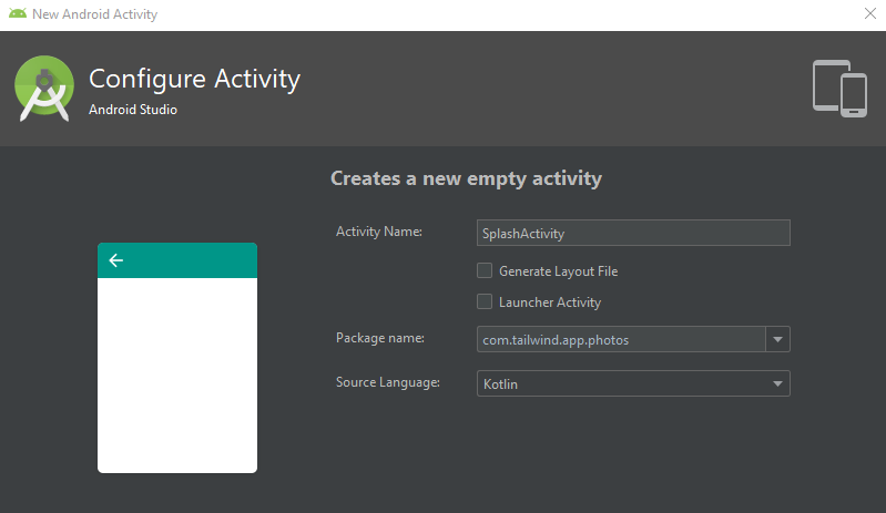
Now that I’ve got the images for the background, I can create a SplashActivity. Use New > Activity > Empty Activity, but uncheck the Generate Layout File checkbox and check the Launcher Activity file.
The code for this SplashActivity is fairly simple:
package com.tailwind.app.photos

import android.content.Intent
import androidx.appcompat.app.AppCompatActivity
import android.os.Bundle

class SplashActivity : AppCompatActivity() {

    override fun onCreate(savedInstanceState: Bundle?) {
        super.onCreate(savedInstanceState)

        startActivity(Intent(this, AuthenticatorActivity::class.java))
        finish()
    }
}
Note the lack of setContentView() call that is commonly used inside of activities. This is deliberate and ensures the activity starts as quickly as possible.
We’ll come back to the AuthenticatorActivity class later on. In the AndroidManifest.xml file, you need to remove the launcher codes from the MainActivity if you have one, and also set a new theme on the splash activity:
<?xml version="1.0" encoding="utf-8"?>
<manifest xmlns:android="http://schemas.android.com/apk/res/android"
          package="com.tailwind.app.photos">

    <application
            android:allowBackup="false"
            android:icon="@mipmap/ic_launcher"
            android:label="@string/app_name"
            android:roundIcon="@mipmap/ic_launcher_round"
            android:supportsRtl="true"
            android:theme="@style/AppTheme">
        <activity android:name=".MainActivity"/>
        <activity android:name=".SplashActivity" android:theme="@style/SplashTheme">
            <intent-filter>
                <action android:name="android.intent.action.MAIN"/>
                <category android:name="android.intent.category.LAUNCHER"/>
            </intent-filter>
        </activity>
    </application>
</manifest>
Finally, add a theme to res/values/styles.xml to ensure the splashscreen.png is displayed:
   <style name="SplashTheme" parent="Theme.AppCompat.NoActionBar">
        <item name="android:background">@drawable/splashscreen</item>
    </style>
You can now create an AuthenticatorActivity that does whatever you want. The app will display the splash screen and then a moment later it will switch to your next activity. At no point will it display a white screen.
Starting the Authenticator
I decided to make my authenticator the next screen. It will handle all the initialization and then handle the authentication as well. I could probably have split the work (add an InitializerActivity and an AuthenticatorActivity) and there are certainly reasons to do that, but the code for each one is so small that I decided against it. Here is my plan. I’m going to put a spinner to indicate “network activity” on the screen (along with a title), then I will do to the initialization in a separate thread. Once I am done, I’ll bring up the rest of the UI for the page and hide the spinner. This will be done using the same background as my splash screen. The user should not see any shifts in the background as a result of the activity change. Let’s start with the AndroidManifest.xml:
<?xml version="1.0" encoding="utf-8"?>
<manifest xmlns:android="http://schemas.android.com/apk/res/android"
          package="com.tailwind.app.photos">

    <application
            android:allowBackup="false"
            android:icon="@mipmap/ic_launcher"
            android:label="@string/app_name"
            android:roundIcon="@mipmap/ic_launcher_round"
            android:supportsRtl="true"
            android:theme="@style/AppTheme">
        <activity android:name=".AuthenticatorActivity" android:theme="@style/SplashTheme"/>
        <activity android:name=".MainActivity"/>
        <activity android:name=".SplashActivity" android:theme="@style/SplashTheme">
            <intent-filter>
                <action android:name="android.intent.action.MAIN"/>
                <category android:name="android.intent.category.LAUNCHER"/>
            </intent-filter>
        </activity>
    </application>
</manifest>
I’m using the same SplashTheme for the new activity so that I get the same background. Now, onto the layout:
<?xml version="1.0" encoding="utf-8"?>
<androidx.constraintlayout.widget.ConstraintLayout
        xmlns:android="http://schemas.android.com/apk/res/android"
        xmlns:tools="http://schemas.android.com/tools"
        xmlns:app="http://schemas.android.com/apk/res-auto"
        android:layout_width="match_parent"
        android:layout_height="match_parent"
        android:background="@drawable/splashscreen"
        tools:context=".AuthenticatorActivity">

    <androidx.constraintlayout.widget.Guideline
        android:layout_width="wrap_content"
        android:layout_height="wrap_content"
        android:id="@+id/authenticator_g_h50"
        android:orientation="horizontal"
        app:layout_constraintGuide_percent="0.33"/>

    <TextView android:text="@string/app_name"
              android:layout_width="match_parent"
              android:layout_height="0dp"
              android:layout_marginStart="32dp"
              android:layout_marginEnd="32dp"
              android:lines="1"
              android:gravity="center"
              style="@style/SplashTheme.TextView"
              app:layout_constraintEnd_toEndOf="parent"
              app:layout_constraintStart_toStartOf="parent"
              app:layout_constraintTop_toTopOf="parent"
              app:layout_constraintBottom_toTopOf="@+id/authenticator_g_h50"/>
    <ProgressBar
        android:layout_width="wrap_content"
        android:layout_height="wrap_content"
        android:layout_marginBottom="64dp"
        android:id="@+id/auth_progress_bar"
        style="@style/SplashTheme.Progress"
        app:layout_constraintEnd_toEndOf="parent"
        app:layout_constraintStart_toStartOf="parent"
        app:layout_constraintBottom_toBottomOf="parent"/>
</androidx.constraintlayout.widget.ConstraintLayout>
Most of this is visual design. I’m using a font called Frederika the Great. Once you have downloaded the font, place it in res/font/frederika.ttf so that it can be referenced properly.
If this is the only time you use the font (or you need to support API levels less than 26), embed the title in the PNG instead. This will reduce the binary distribution size of your app.
In order to use this sort of font embedding, you need to have a minSdkVersion of 26. You can set this in the build.gradle for the module:
android {
    defaultConfig {
        applicationId "com.tailwind.app.photos"
        minSdkVersion 26
        targetSdkVersion 29
        versionCode 1
        versionName "1.0"
    }
}
Onto the res/values/styles.xml file. We have two new styles we have referenced here:
    <style name="SplashTheme.TextView" parent="TextAppearance.AppCompat.Headline">
        <item name="android:background">@android:color/transparent</item>
        <item name="android:textColor">@color/grey_100</item>
        <item name="android:fontFamily">@font/fredericka</item>
        <item name="android:autoSizeTextType">uniform</item>
    </style>

    <style name="SplashTheme.Progress" parent="Widget.AppCompat.ProgressBar">
        <item name="android:background">@android:color/transparent</item>
    </style>
Don’t forget to include the grey_100 color in your colors.xml file:
<color name="grey_100">#F5F5F5</color>I’ve included all the Material Design colors in my
colors.xmlso I can reference them anywhere!
The style for the progress bar is fairly simple. However, there are two notes for the style for my app name. Firstly, note how I specify the font. Secondly, let’s talk about dynamic text sizing. I want the title to be as big as possible relative to the width of the phone. To do this, I create a TextView within the ConstraintLayout that is of maximal width and has a 0dp (or match_constraint) height. I’ve created a horizontal guide at 33% down the screen. The constraints mean the TextView fills that area. However, let’s look at the TextView:
    <TextView android:text="@string/app_name"
              android:layout_width="match_parent"
              android:layout_height="0dp"
              android:layout_marginStart="32dp"
              android:layout_marginEnd="32dp"
              android:lines="1"
              android:gravity="center"
              style="@style/SplashTheme.TextView"
              app:layout_constraintEnd_toEndOf="parent"
              app:layout_constraintStart_toStartOf="parent"
              app:layout_constraintTop_toTopOf="parent"
              app:layout_constraintBottom_toTopOf="@+id/authenticator_g_h50"/>
The android:lines property ensures that the title will appear on one line. The android:gravity will center the text between the top of the screen and the guideline. Don’t use wrap_content on this view - it doesn’t work with dynamic text sizing.
In retrospect, this would have been easier by just including the title on the splash screen graphic. However, I learned about dynamic text sizing along the way!
Moving onto the class, the next step is to do the initialization. Right now, I don’t have any initialization code, but I know it’s coming. It’s best to plan for these things. Here is the initial code for the AuthenticatorActivity:
package com.tailwind.app.photos

import android.os.Bundle
import android.view.View
import androidx.appcompat.app.AppCompatActivity
import kotlinx.android.synthetic.main.activity_authenticator.*
import kotlin.concurrent.thread

class AuthenticatorActivity : AppCompatActivity() {

    override fun onCreate(savedInstanceState: Bundle?) {
        super.onCreate(savedInstanceState)
        setContentView(R.layout.activity_authenticator)
    }

    override fun onResume() {
        super.onResume()

        thread(start = true) {
            try {
                // Do any initialization here

                Thread.sleep(3000L)
                // End of initialization

            } catch (e: InterruptedException) {
                e.printStackTrace()
            } finally {
                runOnUiThread {
                    // Do UI changes after initialization here

                }
            }
        }
    }
}
The major note here is that the thread that does the initialization is done in the onResume() method. This allows the layout to be hydrated so you can see it before initialization starts.
It’s an Authenticator, so UI?
I need a little more UI to handle the authentication requirements. I’m going to display a pill (it looks like a button with rounded corners) filled with the social media authentication techniques that the app supports. I’m a big believer that users should decide how they want to authenticate - not you. I also believe you should not be running your own authentication scheme unless there is a very good reason to do so. So I provide choices - Facebook, Google, Microsoft, and Twitter will be provided. I want this pill to “slide in” from the bottom of the screen once initialization is complete.
Let’s start with the layout additions:
    <androidx.cardview.widget.CardView
        android:id="@+id/social_media_login_buttons"
        android:layout_width="match_parent"
        android:layout_height="64dp"
        app:cardCornerRadius="32dp"
        style="@style/SplashTheme.SocialMediaButtons"
        app:cardBackgroundColor="@color/background"
        android:layout_marginBottom="64dp"
        app:layout_constraintTop_toBottomOf="parent"
        app:layout_constraintStart_toStartOf="parent"
        android:layout_marginStart="16dp"
        app:layout_constraintEnd_toEndOf="parent"
        android:layout_marginEnd="16dp">
        <LinearLayout
            android:layout_width="match_parent"
            android:layout_height="match_parent"
            android:layout_gravity="center_vertical"
            style="@style/SplashTheme.SocialMediaButtons">
            <ImageButton
                android:contentDescription="@string/facebook_auth"
                android:layout_width="wrap_content"
                android:layout_height="wrap_content"
                app:srcCompat="@drawable/ic_facebook_logo"
                style="@style/SplashTheme.SocialMediaButton"
                android:id="@+id/facebook_login"
                android:layout_weight="1" />
            <ImageButton
                android:contentDescription="@string/google_auth"
                android:layout_width="wrap_content"
                android:layout_height="wrap_content"
                app:srcCompat="@drawable/ic_google_logo"
                style="@style/SplashTheme.SocialMediaButton"
                android:id="@+id/google_login"
                android:layout_weight="1" />
            <ImageButton
                android:contentDescription="@string/microsoft_auth"
                android:layout_width="wrap_content"
                android:layout_height="wrap_content"
                app:srcCompat="@drawable/ic_microsoft_logo"
                style="@style/SplashTheme.SocialMediaButton"
                android:id="@+id/microsoft_login"
                android:layout_weight="1" />
            <ImageButton
                android:contentDescription="@string/twitter_auth"
                android:layout_width="wrap_content"
                android:layout_height="wrap_content"
                app:srcCompat="@drawable/ic_twitter_logo"
                style="@style/SplashTheme.SocialMediaButton"
                android:id="@+id/twitter_login"
                android:layout_weight="1" />
        </LinearLayout>
    </androidx.cardview.widget.CardView>
Line 9 sets the top constraint of this layout so that it’s off the bottom of the screen. That’s my starting point - I don’t want the user to see the pill until I slide it into view. In addition, note that I have to specify two properties on the card view to get the right background color and corner radius. I wish these were available in a style instead, but I don’t use this format regularly. The LinearLayout places my four image buttons side by side equally in the pill.
On later API versions, I’ve found using the
CardViewfor rounded corners is easier than using adrawablebackground, especially when you need a transparent background.
The styles in use here are as follows:
    <style name="SplashTheme.SocialMediaButtons" parent="Widget.AppCompat.PopupWindow">
        <item name="android:background">@color/background</item>
        <item name="android:textColor">@color/foreground</item>
    </style>
    <style name="SplashTheme.SocialMediaButton" parent="Widget.AppCompat.Button.Borderless">
        <item name="android:background">@color/background</item>
        <item name="android:textColor">@color/foreground</item>
        <item name="android:layout_gravity">center</item>
        <item name="android:gravity">center</item>
    </style>
The colors.xml has the following:
    <color name="foreground">@color/grey_900</color>
    <color name="background">@color/grey_100</color>
I’ve also added a dimension that I will need later. This is in res/values/dimens.xml, but you can place it in any of the values files that has resources as a root node. They are all treated equivalently.
<?xml version="1.0" encoding="utf-8"?>
<resources>
    <dimen name="social_media_button_offset">64dp</dimen>
</resources>
How did I pick this number? Well, it overwrites the progress bar when it moves up, so I wanted it to be in the same position. Also, it’s high enough that if any bottom navigation bar is covering the bottom of the screen, the pill will float above that bottom navigation bar.
Finally, I’ve also created four 48x48dp drawables. I did this by downloading the logos as SVG files from the Internet (Wikipedia Commons is a great place for this). I then use New > Vector Asset to create each logo drawable.
Now that I’ve got the UI defined in XML, it’s time to animate the pill into the display. This is done in the runOnIoThread section of the onResume() method from earlier:
    runOnUiThread {
        val distance = resources.getDimensionPixelSize(R.dimen.social_media_button_offset).toFloat()

        auth_progress_bar.visibility = View.GONE
        social_media_login_buttons
            .animate()
            .translationY(-distance)
            .setDuration(500L)
            .alpha(1.0f)
            .setListener(null)
    }
My first step is to work out how far I should move the pill. I specify the dimension in display points, but I need to animate based on pixels. Fortunately, the resource manager will do the conversion for me based on the device I am on right now. Once I’ve got that, I make the progress bar disappear (abruptly - no need to slide it out), and then do a simple animation, which will take a half second. I love the .animate() method here as it makes these simple transitions really easy.
Next steps
The app is now runnable. When you run it, you will see the background, then the title and progress spinner will appear for 3 seconds, then the social media login buttons will slide in from the bottom. If you want to see the app code for yourself, take a look at my repository.
Next for me is going to be a series of posts on how to do specific authentication schemes for my buttons. I’ll wire each one up and integrate each platform SDK, then work on the initialization code. If you want to follow along, feel free to follow the repository, or check the new category for Tailwind Photos
Leave a comment