
Add visual testing to your React app with Storybook
In my last article, I started a React app from scratch, then integrated Parcel as the bundler, TypeScript for language support, SASS, ESLint for linting the code, and Stylelint for linting the style sheets. I didn’t include any testing capabilities, so that is next on my agenda.
Let’s write a simple component to get started with testing. The component takes an “isBusy” flag. If it is true, then one icon is displayed. If false, a different icon is displayed. I’ll use text nodes in this version.
import React from 'react';

/**
 * Properties for the BusySpinner component
 *
 * @interface Props
 */
interface Props {
  /** Children to be displayed if the component is not busy */
  children: React.ReactNode;
  /** Determines if the component is considered busy */
  isBusy?: boolean;
}


/**
 * Displays a busy spinner instead of the content if the component is busy.
 *
 * @param props.children to be displayed if the component is not busy
 * @param props.isBusy = false, determines if the component is busy
 */
const BusySpinner: React.SFC<Props>
  = ({ children, isBusy = false }: Props) => {
    if (isBusy) {
      return (<span data-id="spinner">I'm busy</span>);
    }

    return (<>{children}</>);
  };

export default BusySpinner;
I keep my components organized into two directories:
src/lib/componentscontains the basic components I include in every project.src/ui/componentscontains the components that are particular to this project.
Each component gets its own directory, so the BusySpinner component is located in src/lib/components/BusySpinner/index.tsx. Other files about that component (like styles, stories or tests) can be situated alongside the component then. While this isn’t a real component that I use (it’s too simplistic), it does illustrate our problem.
Now, back to the problem for the day:
- How do I display the component to visually inspect it?
Introducing Storybook
Storybook renders components within a page but outside your application. It allows you to build up a library of components that are then rendered within the Storybook UI. You can develop the components separately from the main logic of your code.
To start, you need to configure Storybook:
$> npx -p @storybook/cli sb init
This will detect that you have a React app and integrate itself into your app. It adds the right modules to your package.json, sets up a script to allow you to run the Storybook UI, and adds a simple configuration file in .storybook/main.js. It also creates a couple of default stories, which I promptly delete.
To start with, you can’t write Typescript stories out of the box. We’re also using SASS as our language of choice. It doesn’t deal with that either. Fortunately, these are available as preset options:
$> npm i -D @storybook/preset-typescript @storybook/preset-scss
$> npm i -D css-loader sass-loader style-loader
Then update the .storybook/main.js to include the plugins and to alter where Storybook looks for the stories:
module.exports = {
  stories: [
    '../src/**/*.stories.tsx'
  ],
  addons: [
    '@storybook/preset-typescript',
    '@storybook/preset-scss',
    '@storybook/addon-actions',
    '@storybook/addon-links'
  ],
};
Now, let’s write a set of stories for the component. I place these alongside the component itself, in a file called BusySpinner.stories.tsx:
import React from 'react';
import BusySpinner from '.';

export default {
  title: 'lib/components/BusySpinner'
};

const rootStyle: React.CSSProperties = {
  backgroundColor: '#F0F0F0',
  color: '#000000',
  padding: '1rem'
};

/* Story #1 - the component is busy */
export const isBusy: React.SFC<{}> = () => (
  <div style={rootStyle}>
    <BusySpinner isBusy>
      <p>This is the real content</p>
    </BusySpinner>
  </div>
);

/* Story #2 - the component is not busy */
export const notBusy: React.SFC<{}> = () => (
  <div style={rootStyle}>
    <BusySpinner>
      <p>This is the real content</p>
    </BusySpinner>
  </div>
);
When you run the Storybook with npm run storybook, you can see the heirarchy of components (of which there is one right now). Under that component is the two stories that have been defined. You can move between them with just a click. I’ve wrapped the component in a div with some styling so I can see the component “in context”. I could also do this with a decorator function:
import React from 'react';
import { addDecorator } from '@storybook/react';
import BusySpinner from '.';

export default {
  title: 'lib/components/BusySpinner'
};

const rootStyle: React.CSSProperties = {
  backgroundColor: '#F0F0F0',
  color: '#000000',
  padding: '1rem'
};
addDecorator((storyFn) => (<div style={rootStyle}>{storyFn()}</div>));

/* Story #1 - the component is busy */
export const isBusy: React.SFC<{}> = () => (
  <BusySpinner isBusy>
    <p>This is the real content</p>
  </BusySpinner>
);

/* Story #2 - the component is not busy */
export const notBusy: React.SFC<{}> = () => (
  <BusySpinner>
    <p>This is the real content</p>
  </BusySpinner>
);
This format is good if you have a lot of stories and they all have the same wrapper. I tend to use decorators when I’m doing a component that belongs in a toolbar, for example.
Documenting your components
You can also use the Storybook as a central documentation for your components. First, add the docs addon to the solution. Install the library:
$> npm i -D @storybook/addon-docs
Then add it to the configuration file in .storybook/main.js:
module.exports = {
  stories: [
    '../src/**/*.stories.tsx'
  ],
  addons: [
    '@storybook/preset-typescript',
    '@storybook/addon-actions',
    '@storybook/addon-links',
    '@storybook/addon-docs'
  ],
};
Then run your storybook. Even out of the box, you get something basic. However, you can go further. By adding a single entry to the default export of the stories file (the component), you can create additional documentation. Here is the updated default export for my story:
export default {
  title: 'lib/components/BusySpinner',
  component: BusySpinner
};
And this is what it generates:
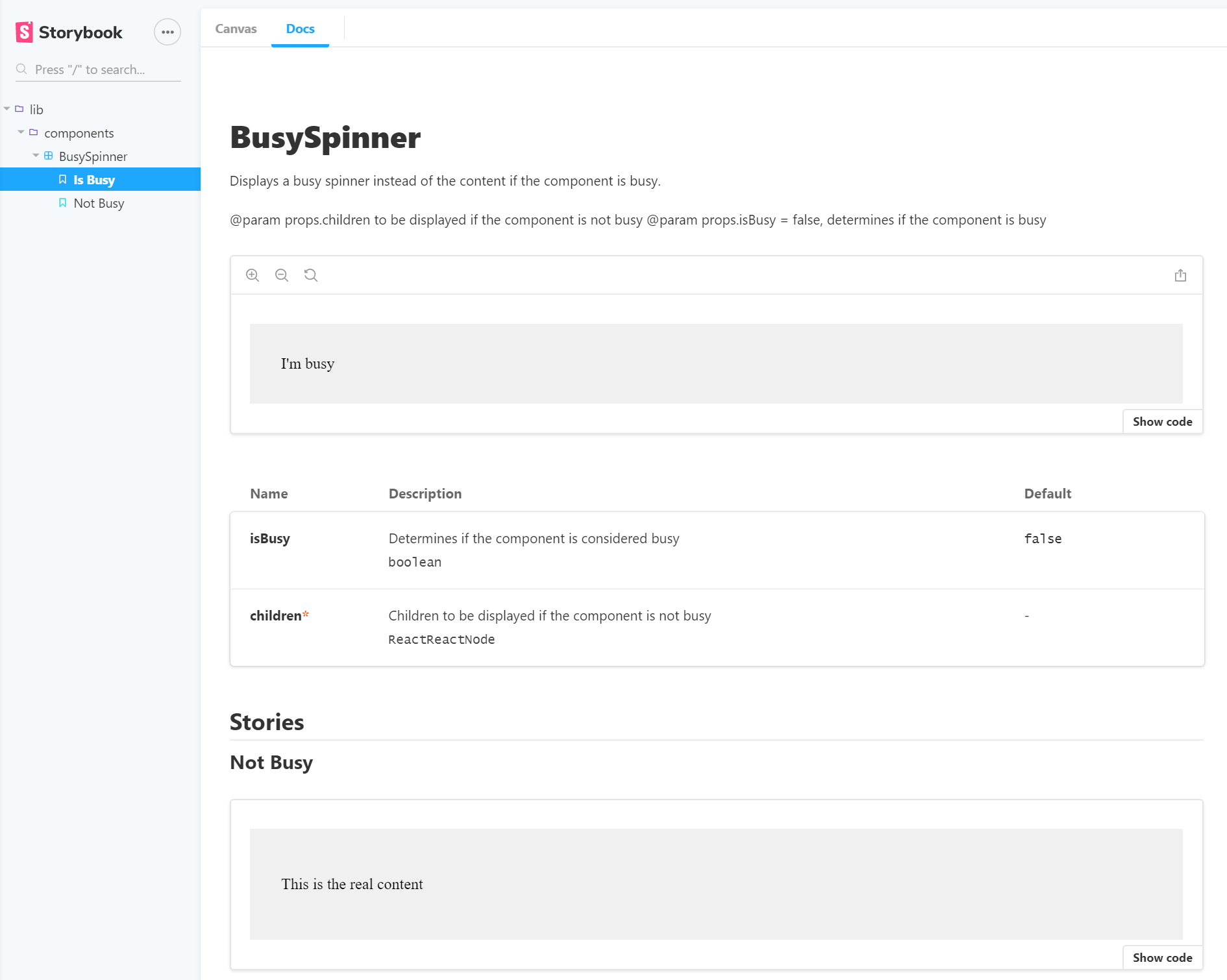
It’s added a Docs tab filled with information on the component. It is a tad messy, but that allows us to tighten up the Docstrings within the code.
Introducing knobs
Another thing we can do rather easily is to introduce “knobs”. In our simple case, the only difference between the two stories is the isBusy flag. If we could tweak that flag, we wouldn’t need the second story. We could handle it with just one. Well, there is an addon called addon-kobs for that. You install it via npm:
$> npm i -D @storybook/addon-knobs`
And enable it in the same way as other addons:
module.exports = {
  stories: [
    '../src/**/*.stories.tsx'
  ],
  addons: [
    '@storybook/preset-typescript',
    '@storybook/addon-actions',
    '@storybook/addon-links',
    '@storybook/addon-docs',
    '@storybook/addon-knobs'
  ],
};
Now, I can add the knobs to the story:
import React from 'react';
import { addDecorator } from '@storybook/react';
import { withKnobs, boolean } from '@storybook/addon-knobs';
import BusySpinner from '.';

export default {
  title: 'lib/components/BusySpinner',
  component: BusySpinner,
  decorators: [ withKnobs ]
};

const rootStyle: React.CSSProperties = {
  backgroundColor: '#F0F0F0',
  color: '#000000',
  padding: '1rem'
};
addDecorator((storyFn) => (<div style={rootStyle}>{storyFn()}</div>));

/* Story #1 - the component is busy */
export const normal: React.SFC<{}> = () => (
  <BusySpinner isBusy={boolean('isBusy', false)}>
    This is some content
  </BusySpinner>
);
The knobs are included in two places:
- In the
decoratorssection of the default export. - As a parameter in the story.
There are “knobs” for text, boolean, numbers, and so on. If your component is accepting custom classes or object shapes, then this isn’t a great solution. When you run your storybook, you can see the isBusy flag under the Knobs tab:
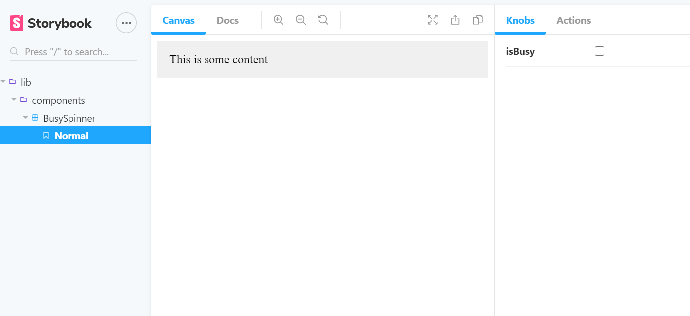
Adjusting the knob for isBusy changes the content dynamically.
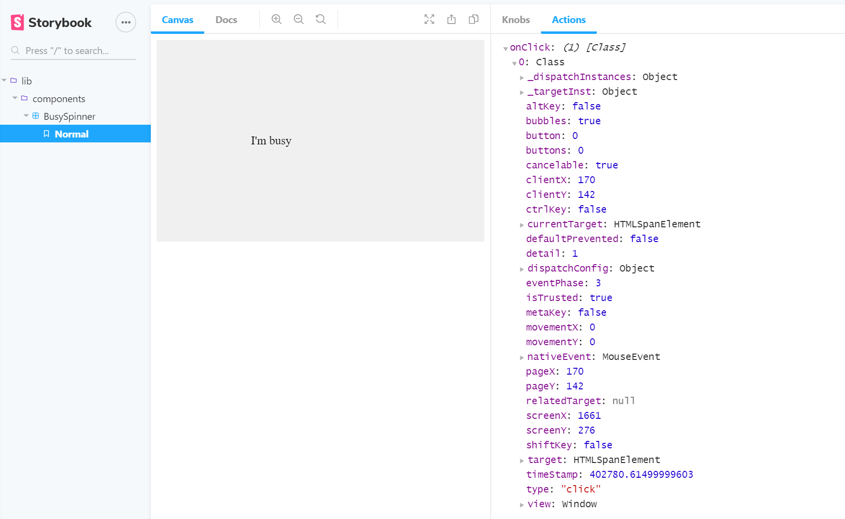
Handling callbacks
Most components I write have some sort of user interactivity. They report their state changes to a higher level so that they can be easily composed. That means we need to be able to see what is being returned to the higher level via callbacks. This is handled by an addon called actions. It’s such a common requirement that it is installed by default.
I’ve adjusted my sample so that if you click on the “busy” text, it will call an onClick event handler with the sending event. Let’s adjust the story to show the actions:
import React from 'react';
import { addDecorator } from '@storybook/react';
import { withKnobs, boolean } from '@storybook/addon-knobs';
import { action } from '@storybook/addon-actions';
import BusySpinner from '.';

export default {
  title: 'lib/components/BusySpinner',
  component: BusySpinner,
  decorators: [ withKnobs ]
};

const rootStyle: React.CSSProperties = {
  backgroundColor: '#F0F0F0',
  color: '#000000',
  padding: '1rem'
};
addDecorator((storyFn) => (<div style={rootStyle}>{storyFn()}</div>));

/* Story #1 - the component is busy */
export const normal: React.SFC<{}> = () => (
  <BusySpinner isBusy={boolean('isBusy', false)} onClick={action('onClick')}>
    This is some content
  </BusySpinner>
);
When you run the storybook now, set the component to busy, and click on the words, you can see the event:
What’s next?
Could this have been done in CRA? Absolutely - you can use the same mechanisms with create-react-app. Storybook works independently of the underlying application. There is even a plugin for create-react-app to ensure maximum compatibility. Having gone through the process now, I hope you’ll try out this approach to visual development and documentation of your components.
Of course, this doesn’t replace rigorous testing of your app. In the next article, I’m going to be covering unit testing and integrating a test runner into my template. Until then, you can find the current template on my GitHub repository.
Leave a comment