
Handling orientation changes in React Native
I’ve just returned to my JavaScript days and am trying to learn React Native again. One of the things I like to do is to produce a “perfect” app – one that will work on both tablet and phone in any orientation and that includes all the best practices. Things like my Notes App on Android, for example, took me off to learn content providers. React Native is no different. There are a bunch of things you just have to know.
One of the things I want to do is to produce a single app that does master-detail properly for both tablets and phones. To do that, I needed to be able to do two things:
- Figure out if I was on a tablet.
- Adapt to the orientation.
In master-detail workflows, you have a list page (the master) and a detail page. They are shown as two separate pages on a phone or on a tablet in portrait mode, but they are shown side-by-side if the device is a tablet in landscape mode.
React Native exposes an object called Dimensions that gives you all the information you need for this. You use it like this:
const dim = Dimensions.get('screen');It returns something like this:
{
  "scale": 2,
  "height": 667,
  "width": 375,
  "fontScale": 1
}
This is generated from an iPhone 6, so you may get different results. To get the real-dots, you multiply the scale by the dimension. I’ve used this to create a set of methods(in a utility JavaScript module called Platform.js) that gives me the information I need:
import { Dimensions } from 'react-native';

/**
 *
 * @param {ScaledSize} dim the dimensions object
 * @param {*} limit the limit on the scaled dimension
 */
const msp = (dim, limit) => {
    return (dim.scale * dim.width) >= limit || (dim.scale * dim.height) >= limit;
};

/**
 * Returns true if the screen is in portrait mode
 */
const isPortrait = () => {
    const dim = Dimensions.get('screen');
    return dim.height >= dim.width;
};

/**
 * Returns true of the screen is in landscape mode
 */
const isLandscape = () => {
    const dim = Dimensions.get('screen');
    return dim.width >= dim.height;
};

/**
 * Returns true if the device is a tablet
 */
const isTablet = () => {
    const dim = Dimensions.get('screen');
    return ((dim.scale < 2 && msp(dim, 1000)) || (dim.scale >= 2 && msp(dim, 1900)));
};

/**
 * Returns true if the device is a phone
 */
const isPhone = () => { return !isTablet(); }

export default {
    isPortrait,
    isLandscape,
    isTablet,
    isPhone
};
I can use this in a standard React Native application like this:
render() {
    return (
        <View style={styles.container}>
            <Text style={styles.welcome}>
                Welcome to React Native!
            </Text>
            <Text style={styles.instructions}>
                Dimensions = {JSON.stringify(Dimensions.get('screen'))}{'\n'}
                isPortrait = {Platform.isPortrait() ? 'true\n' : 'false\n'}
                isLandscape = {Platform.isLandscape() ? 'true\n' : 'false\n'}
                isPhone = {Platform.isPhone() ? 'true\n' : 'false\n'}
                isTablet = {Platform.isTablet() ? 'true\n' : 'false\n'}
            </Text>
        </View>
    );
}
And this produces output like this:
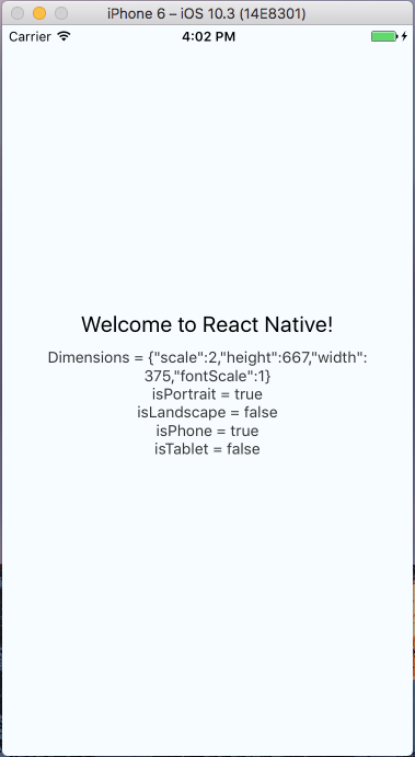
Hold on though. Try to rotate that device – it does not re-render the react tree, which means I don’t have orientation detection. To handle that case, I need to add state to the top level react component that detects the orientation. I use the following:
constructor() {
    super();

    this.state = {
        orientation: Platform.isPortrait() ? 'portrait' : 'landscape',
        devicetype: Platform.isTablet() ? 'tablet' : 'phone'
    };

    // Event Listener for orientation changes

    Dimensions.addEventListener('change', () => {
        this.setState({
            orientation: Platform.isPortrait() ? 'portrait' : 'landscape'
        });
    });
}
I store the orientation in the state object, then add an event listener. Whenever the dimensions change (for example, due to an orientation change), the state is changed and that causes a re-render of the entire react tree.
As to why this is important? I can now create a MasterDetail react component that takes the master object and the detail object. In the phone (or tablet in portrait mode), I render a navigation bar plus master list OR the detail page, depending on what is selected. On a tablet in landscape mode, I render a flex layout that combines the master list and detail page. I’ll provide more on this topic in my next blog post.
Leave a comment